We hear you: High DPI-friendly UI on the way
As always, it’s been a very busy time of the year for the WS team. Between the dev work for all the cool new stuff we have been preparing for [REDACTED] and our recent Pro tour on the US , there’s been truly no rest for the wicked – or the virtuous for that matter.
One of our top priorities on the commercial side of development has been to resolve the issues that have arisen related to the increasing use of high-DPI desktop setups. As our regular players know, we started tackling this issue already from summer, with the release of v1.11 SR1 and with the subsequent update releases supporting the Command-LIVE DLCs.
Microsoft’s Windows 10 Anniversary Update (aka “Redstone”), a massive update that appears to have left a bitter taste in the IT industry, also apparently wound back the clock on our hard work on DPI remedies. The combination of “Win10 Redstone + high-DPI desktop” was particularly hostile to our UI fixes and caused significant issues with readability, especially on important information displayed on the right vertical column. We released a number of hotfix executables to remedy this as much as possible but we were well aware that these, along with our “temporary workaround” recommendation to use 100% DPI settings, were only just temporary. Something more permanent was becoming necessary.
So we rolled our sleeves and went to work:
The right-column UI element was completely re-written using high-DPI-friendly technologies and techniques and we are happy to report that on our repeated tests so far, it scales beautifully from 1366×768 cheap laptops all the way to NORAD wall screens.
Re-writing the UI stack for this important screen element also gave us the chance to sneak-in some oft-requested improvements that we never seemed to have the time to devote to so far. For example:
* A vertical scrollbar now runs the full length of the column and allows scrolling to the lowermost info panels without needing to collapse the (often essential) unit-status and unit-weapons panels.
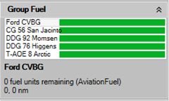
* At-a-glance fuel summaries for group members. You asked for it, and we’re happy to oblige. Clicking on any of the fuel bars provides the full details on the relevant unit’s fuel status, radius, persistence etc.

* At-a-glance summary bar for the status of a unit’s components. The full damage-control window is still there for details, but now you no longer have to bring it up to get a feeling of how your unit’s internal guts are holding up. (Pro tip: The less green on that bar, the more in trouble you are).
We hope to be able to include these and other improvements on the forthcoming v1.11 SR6 update, which will accompany the release of Command LIVE #4: Don of a New Era. We thank everyone who has reported to us the high-DPI issues and shared with us their patience for a definite solution, and we are confident you will enjoy this revised portion of the UI as much as we and the beta team currently do.
Stay tuned!
Comments
Leave a Reply
You must be logged in to post a comment.


